MedGulf — A modern insurance portal & after-sale dashboard
Redesigning MEDGULF's primary landing page and after-sale dashboard — a clearer route from quote to policy management.
- Client
- MEDGULF
- Year
- 2024
- Role
- Product Designer — UX & UI
- Industry
- Insurance
Overview
As a product designer on MEDGULF's digital team, I led the complete redesign of the company's primary landing page and after-sale portal. Working independently, I managed the entire process from user research through final implementation, collaborating with engineering and marketing stakeholders throughout.
The problem
The legacy MEDGULF experience made it hard for customers to get a quote, find the right product, and manage their policies after purchase. The brand needed to convey both innovation and trustworthiness, while existing dashboards buried policies, claims, and member management behind dense, inconsistent screens.
Process
- User research and stakeholder interviews across digital and marketing teams
- Developed an illustration style that reflects modern Saudi lifestyles while keeping professional credibility
- Tested a light blue palette with focus groups to balance innovation and trust
- Built interactive Figma prototypes and ran usability tests with 12 participants
- Iterated on button placement for mobile interaction and refined the testimonial section for stronger credibility signalling
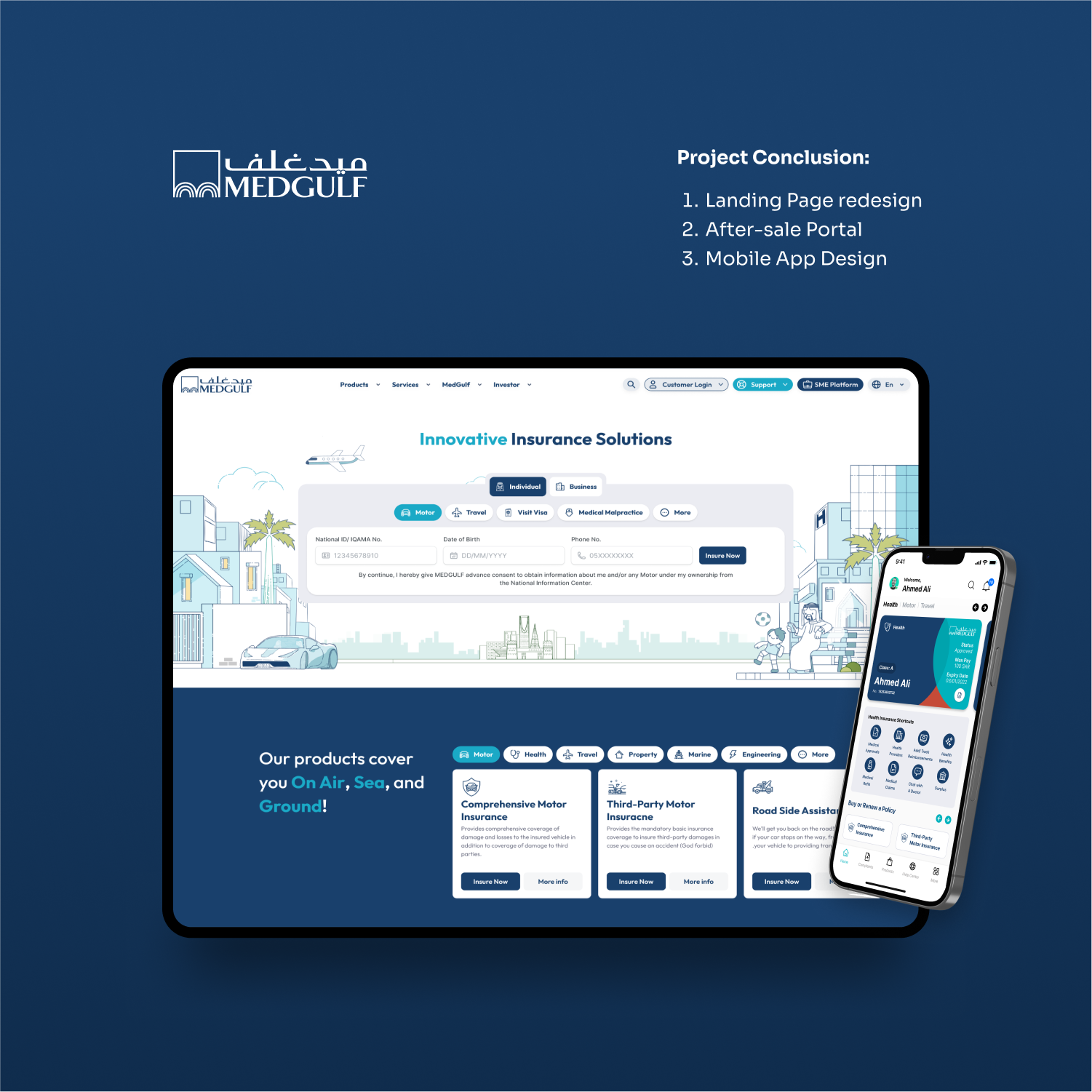
The solution
A new landing page that opens with a friendly quote widget and product-led storytelling, an after-sale login flow with OTP verification, a focused dashboard for policies, claims, and approvals, a detailed policy page with member management, and a claims module with cash-claim creation and document upload.
Outcome
- A unified design system covering web landing, after-sale dashboard and mobile app
- Clear post-purchase journey: policies, claims, approvals and member management in one place
- Local payment, language and identity patterns (Iqama, Arabic/English) baked into every flow
Heuristic evaluation
Applied Nielsen's 10 usability heuristics to identify friction and ship targeted fixes.
Finding · Customers couldn't tell at a glance which policies needed action, were active, or were expiring.
Fix · Status pills (Active, Renewal Required, Action-required) and a renewal banner on each policy with a clear primary action.
Finding · Insurance jargon and English-only forms blocked Saudi customers.
Fix · Bilingual Arabic/English UI, locally-recognisable identity fields (National ID / Iqama), and product names that match how customers describe their needs.
Finding · Members, dependents, and coverage options were spread across separate screens.
Fix · Policy page consolidates plan, premium, dates, members and coverage actions in one scannable layout.
Finding · Adding many members one by one was slow for HR/SME admins.
Fix · Bulk Excel import alongside the single 'Add Member/Family' form — same outcome, two speeds.
App screens
Have a project worth designing well?
Tell me what you're shipping. Free 30-min intro · reply within 24h.
Book a 30-min intro