Nakhla — A calmer way to invest in Saudi funds
An investment platform that helps Saudi users make wiser financial decisions and confidently grow their portfolio.
- Client
- Nakla.com
- Year
- 2023
- Role
- Lead Product Designer — UX & UI
- Industry
- Fintech
Overview
Nakla is an investment platform in Saudi Arabia that helps users make wiser financial decisions and earn strong returns. The app needed to translate complex fund data into a calm, confidence-building experience for first-time investors as well as power users tracking allocations and transactions.
The problem
First-time investors were intimidated by jargon-heavy screens, opaque fund details, and unclear transaction states — leading to drop-off during onboarding and hesitation before placing the first investment.
Process
- Audited existing flows against Nielsen's 10 heuristics
- Mapped the end-to-end journey from onboarding to first investment
- Designed a 4-step onboarding that explains risk, returns, and fees in plain language
- Built a fund list, fund details, portfolio, and transactions module on a shared design system
- Validated with usability tests across novice and experienced investors
The solution
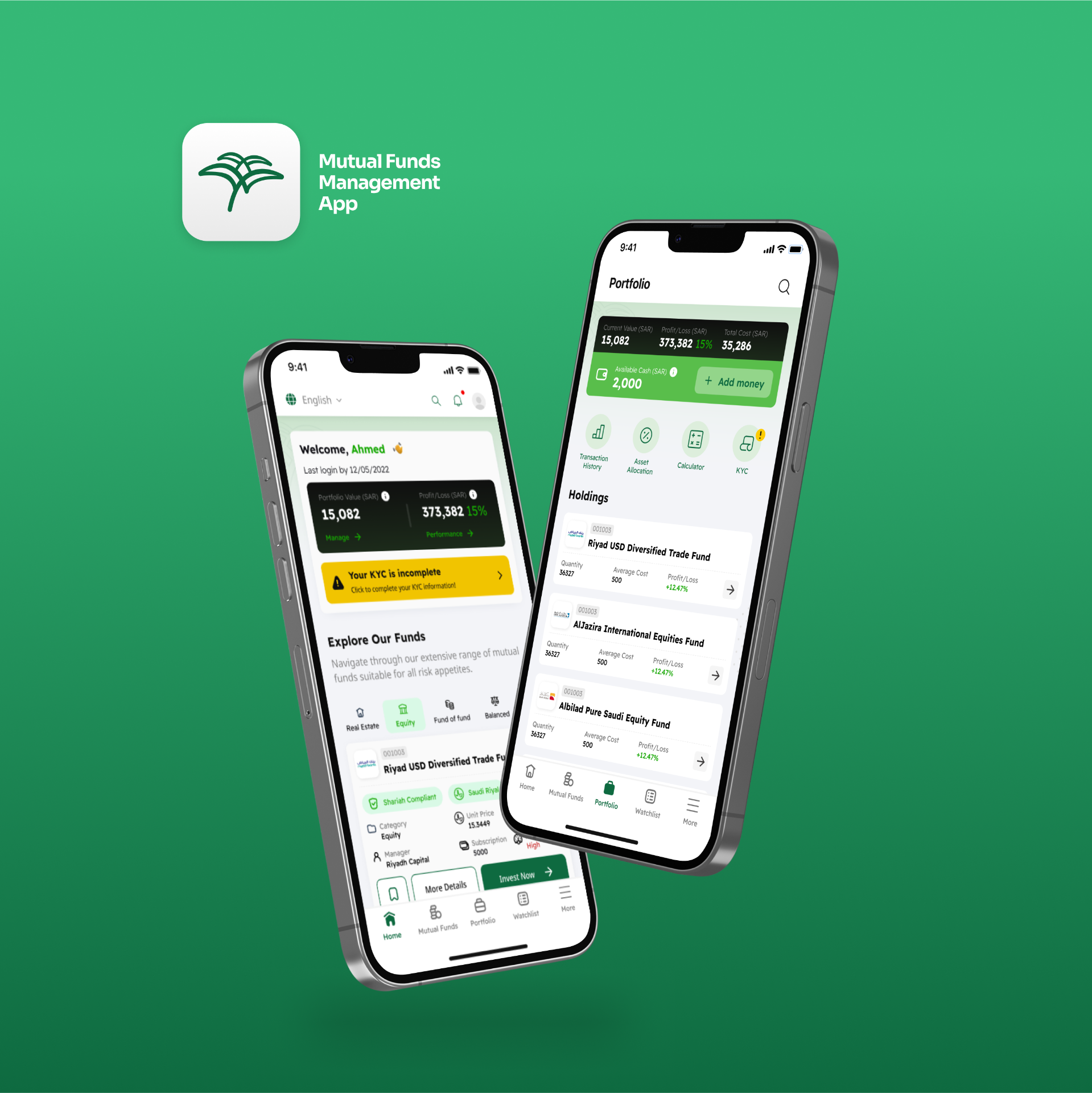
A focused mobile experience: a friendly onboarding that sets expectations, a scannable fund list with risk badges, a portfolio view that visualises allocation at a glance, and a transactions screen with filters and clear status states.
Outcome
- Onboarding completion improved as risk concepts became visual
- Fund details became the highest-engagement screen — users compared before investing
- Transactions filter and status reduced repeat support questions
Heuristic evaluation
Applied Nielsen's 10 usability heuristics to identify friction and ship targeted fixes.
Finding · Transaction states (pending, settled, failed) were buried in long lists.
Fix · Added colour-coded status pills + a transactions filter so users always know where their money is.
Finding · Fund jargon (NAV, AUM, TER) blocked first-time investors.
Fix · Plain-language tooltips and an onboarding primer translate finance terms into everyday language.
Finding · Users had to remember which funds they had compared.
Fix · Persistent portfolio + recently-viewed fund cards on the home screen.
Finding · Users could submit invest amounts above their wallet balance.
Fix · Inline validation, max-amount shortcut, and a confirm sheet that summarises the order before submit.
App screens
Have a project worth designing well?
Tell me what you're shipping. Free 30-min intro · reply within 24h.
Book a 30-min intro